Rachel Beach Paints the Rainbow in Brooklyn
By
March 24, 2009
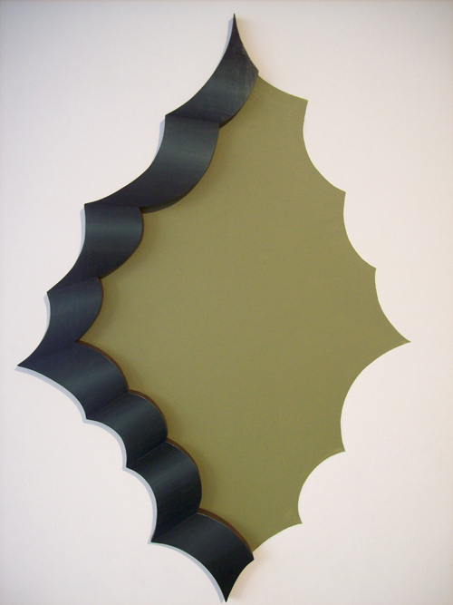
Rachel Beach makes sculptural abstractions for which Tomma Abts’ art is a relevant comparison, although their working methods are vastly different. Beach, a Yale MFA in painting, relies on marquetry: She cuts various shapes into wood, covers them with veneers, and then paints their edges. Beach’s paintings are often biomorphic in shape: some are reminiscent of an aged cheese rind; others more complexly capture design motifs; still others are fantasies that conjure rabbits’ holes—or rosy sphincters, depending on your persuasion. Beach’s playfully amoebic forms are painted with color gradients that transform her compositions from flat planes to fleshy three-dimensional objects. Allan McCollum’s “Shape Project” (2005) explores similar territory, but in Beach’s hands the challenge of discovering new forms is delivered in a shock of color. Each composition is a living organism, not a blank-faced conceptual meme. The latest body of work “Towers and Portals”, her strongest material to date, is a pleasurable medley that cuts at the core of a half century of abstract painting: What comes first in the process of making an image? Color or shape? Scale or proportion? Composition or detail?
STEVE PULIMOOD: Was wood-working always a part of your artwork? Or did you paint similar abstractions on canvas first?
RACHEL BEACH: I began learning wood-working through building painting stretchers. As the disconnect between what’s on a painting’s surface and the physical object-ness of the painting itself became increasingly frustrating, my stretchers became fatter with exposed wood sides… I was becoming a ‘craftsman’, but I was also getting an idea about the relationships between image and object.
SP: Would you return to a blank canvas?
RB: I was taught how to build painting stretchers, from there I am self-taught. I have worked in the architecture/construction field where building objects is part of the skill set and there was some osmosis of how to build. Conceptually I branched into sculpture with a series called “Pairs” where I was combining a traditional painting with a sculpture—trying to make a connection between the form, the material and their meanings. I hadn’t yet figured out how to get image and object into one thing. I can’t see myself making a plain ol’ painting—though I don’t mean it disparagingly—unless I can find a very compelling reason.
SP: When I first saw one of your wall-hanging pieces I immediately thought of Tomma Abts… but for her all the paintings are the same size, and scale is a real constraint. Now I’m considering the early minimalist paintings of Frank Stella, especially when he was struggling to create the perfect picture-as-object and a whole range of shapes, sizes, and colors emerged as potential resolutions.
RB: You have hit on one of my loves—Stella. My heroes are Judd and Stella. My mom took me to the Art Gallery of Ontario as a child. I was about 3 feet tall and pressed my face into the bottom half of a Judd stack piece (I’m still a bit of an art toucher). My heart soared for that Judd. Until then a lot of art I had only seen images of (I sometimes wonder if this has influenced my work… the idea of seeing images of objects as opposed to seeing the objects themselves). And Stella, early Stella… I am mesmerized by the simple elegance of the brush dictating the mark and the cumulative marks dictating the canvas. And then of course he flips it. This is the kind of rotational logic I try to set up in my pieces.
SP: The curator Bob Nickas just told me a story about hearing Donald Judd speak about his work and a very eerie sense of his prickly personality was invoked. I am not sure Judd would have appreciated your curvaceous work, but I think you should get in contact with Stella!
RB: Judd would have tried to hate me but I would have charmed him.
SP: Describe how each work is made? Do you begin with a sketch?
RB: All my pieces start as little sketches. They are kind of after-the-fact images (retinal burns?) or generalizations of things I have seen-architecture snippets, objects, 2-D design, signage. I sketch them. Plus I have a huge image bank at the studio. Then I scour back through all the little sketches, choose a handful to be templated. The templates are made of brown paper, black marker and chalk pastel. Cutting these out is like a mini-preview. I can see right away which ones will do their thing or not. Then I choose which will be made as objects. The templates are transferred to plywood and I begin building. It’s all cut out on the band saw and assembled. Once I start a piece, it doesn’t change much.
SP: What about color?
RB: Color is very important. It goes a long way to create the character of the piece. For me, assigning color has an anthropomorphic outcome. That’s part of it. Color has a real power to wrangle some of the cultural references. It’s a vehicle for meaning and so I agonize over it. But that doesn’t mean it’s not an abstraction. I get very curious about how meanings are made and then culturally agreed on to the point where everyone can say, yeah, this thing means “X.” It’s different from universal meaning but it’s on the same sliding scale. I think color can be the leader in describing a culturally agreed upon meaning, and so I try to harness that.
SP: You have no choice now but to reveal your favorite color.
RB: I love the rainbow.
SP: Careful, it might affect all future interpretation of your work!
RB: And baby blue. I’ve been loving black and white as of late.
SP: Some painters I know walk around with paint under their fingernails and spattered on their jeans. Do you have splinters to show for your work?
RB: I’m all scraped up.
Rachel Beach, “Towers & Portals,” is on view at Like the Spice through April 12. Like the Spice is located at 224 Roebling Street, Brooklyn, NY.