Deeper Underground: Clayton Cubitt
By
April 3, 2009
Time You Made Up Your Mind: Just What Is It All Worth? 2008
“Erotica is using a feather,” wrote Chilean-American novelist Isabel Allende, “pornography is using the whole chicken.” Photographer Clayton Cubitt takes Allende at her word. His pornographic photographs of models and copulating couples are best described as juicy, meaty and, fulfilling. The subject matter might sound pretty, but it isn’t always—chickens are not the beauty queens among birds. Cubitt’s beautiful body of works is a study in contrast of the irregular and irrepressible physicality of sex and his controlled, sleek sense of style. His work is gritty without being earnest or silly, and a playful yet mature intimacy in his approach to “adult play.”
Cubitt’s portrait of a girl’s smooth, alabaster vagina within a matching-colored antique frame from his “Cream” series was recently included alongside work by John Currin, Tracey Emin, Richard Phillips, Paul McCarthy, Lisa Yuskavage and Orly Genger in “Talk Dirty to Me,” at New York’s Larissa Goldston Gallery. Cubitt is currently working on a series of large-scale nudes splattered with Indian ink. And though he is definitely not shy, he will have unattributed work (although it will be unmistakably his) in the upcoming “Anonymous” group show at New York’s Envoy gallery. Here we discuss the many facets of his work, which he laments is too often misconstrued as “too porn for the art world, too art for the porn world. And too art-porn for the commercial world.”
ANA FINEL HONIGMAN: Aesthetically what separates your art from your fashion photography?
CLAYTON CUBITT: I’m almost mentally incapable of drawing a distinction between art I make for the masses, or my clients, and that I make for myself. It all flows from what gets me off, ultimately. It’s my viewpoint, and I don’t particularly care if it gets seen by gallery patrons, magazine readers, internet audiences, or my friends, as long as it gets seen.
AFH: How do you relate to the Gonzo art/porn aesthetic of guys like Terry Richardson and Richard Kern?
CC: I love Terry’s work. It has a power and immediacy. Ditto Juergen Teller. I also like Terry’s ability to transgress, and be rewarded for it. Shooting major ad campaigns and celebrities while publishing books by and about your penis is a lot more difficult than it looks. But I confess to getting quickly bored by one style of expression, and I like to experiment with all different sorts of modes. I rebel against familiar tools.
AFH: How does that sensibility apply to your highly polished style, which seems more in an Araki school?
CC: That’s a great compliment, although I didn’t discover Araki’s work early enough to count him as an influence. But when I did see his body of work, and how voraciously he jumps around while maintaining an outlook that comes through no matter how he’s presenting it, I was very encouraged about my own work. I had previously always harbored fears that my curiosity and variety were weaknesses. Araki showed me otherwise. And it looks like I’m well on course to have as much trouble with skittish publishers and censors as he had. (LEFT: There The Richest Was Poor, And The Poorest Lived in Abundance, 2008)
AFH: For example…?
CC: I’ve had many projects cause me problems. A magazine that published a retrospective of my work was forced by their distributor to put black censor dots over a few pages that were considered too graphic for distribution. I had two pieces included in the first edition of the high-end art collectible “The Playground,” and two different printers refused to print due to explicitness, so the publishers wound up having to print them all by hand. And after all that, Barneys refused to stock it due to the pieces. Luckily, Colette in Paris is less prudish. WWD wrote about the controversy, which greatly helped sales.
AFH: Does that affect your commercial career?
CC: Sure, the controversy definitely cuts both ways. I find it amazing how much power and polarization that images of the naked human form can inspire. Perhaps that’s partly why I’m so obsessed with it.
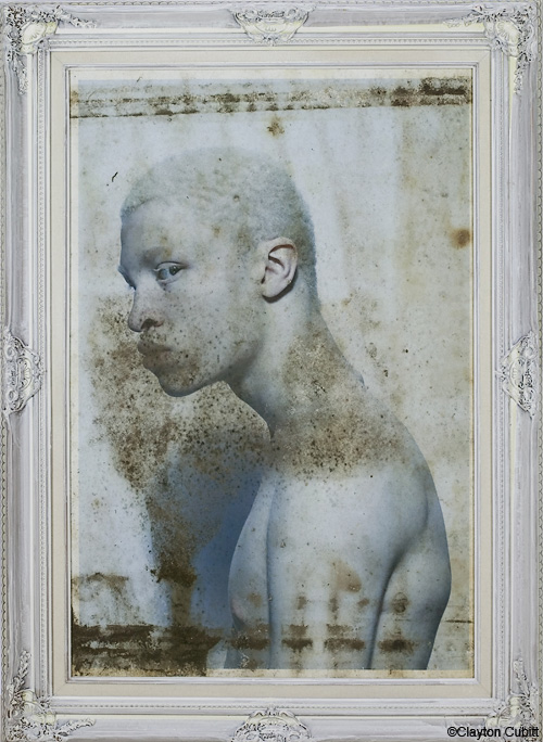
AFH: Are these issues of suppression and exposure part of the thinking behind your buried prints?
CC: I actually began abusing, weathering, and burying prints in 2007, although the idea had been kicking around in me since late 2005. At first it was just a cathartic reaction to what I had seen nature do to my family snapshots and belongings after Hurricane Katrina. So many of my childhood relics, and worse, my family’s current belongings, were destroyed. But in this destruction I kept finding myself fascinated by the grotesque beauty of it. Like a car accident, or the bodies of Pompeii. New Orleans is a modern American Atlantis. So this was an attempt for me to bring under my own artistic control what had been an episode of complete chaos and destruction. But as I started working with it I found other things about it to love. Like the fact that the resulting mold-ridden prints are very toxic. Look too closely and it could kill you. Is the frame of the glass protecting the print, or the viewer? The images won’t stop decaying once I seal them up.
AFH; How else do you see your upbringing influencing your work?
CC: My upbringing has been pushing and pulling my work my whole life.
At first it pushed me away, as I sought to clean up my mind with a style that was slick and glossy, aspirational and wrapped in fantasy. That’s still largely how I approach my fashion work. More recently it’s pulled me back, particularly since Katrina, and as I get older and lose some of that shame that’s inherited with poverty.
AFH: How much control to you have over the end result of the buried prints?
CC: They force me, as a control freak, to surrender. It’s very random, and closer to painting or even farming than photography. It’s also excruciatingly slow. Just as digital technology speeds up photographic creation to being nearly instantaneous, the time it takes for me to make each piece in this series is measured in months. After I started working on these I discovered that Stephen Gill had been doing something very similar, for different reasons and with different aesthetic results, in his “Buried” series, which I think was 2006 or so. And Bill Morrison was doing something similar, and stunning, with his film ‘Decasia’ in 2002, which I discovered only in 2006.
AFH: What are you aiming to articulate with this technique, and the Indian ink works, that you can’t with different methods?
CC: The instantaneous attack, frozen only in the damage it inflicts, is very important to the final pieces for me. I could achieve the same look deliberately, by painting the splatter, or by using the computer, which would enable me to be more exact and repeatable. But it’s important to me that the splatter is a strike, a lashing out, and that each piece is unique and individual, and that the damage is not in my control. I like this lesson.