Amanda Williams’ Color Theories
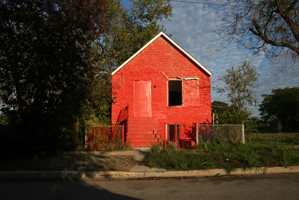
On Sunday morning, during the opening weekend of the inaugural Chicago Architecture Biennial, architect-turned-artist Amanda Williams assembled a group of volunteers to paint an abandoned house situated on a deserted block in Englewood, one of Chicago’s Southwest neighborhoods. The chosen color was a reddish orange, or what she defined as the color of “Flaming Red Hots” potato chips. Prior to that brisk fall Chicago morning, Williams, as part of her ongoing installation series entitled “Color(ed) Theory,” painted other houses in the area various colors—”Oil Moisturizer” pink, “Currency Exchange” yellow, “Harold’s Chicken Shack” red, “Crown Royal” purple, and “Ultra Sheen” blue—that reference popular African American cultural products.
By painting houses recognizable colors that evoke communal experiences, Williams intends to call attention to the urban decay in one of America’s most celebrated black neighborhoods. As Williams and her painters made broad strokes with their brushes, the steeply pitched roof house sat alone next to one of the neighborhood’s more than 5,000 vacant lots—a symbol of the American dream gone awry. The home that once belonged to a black family is slated for demolition, and Williams, who grew up in Englewood before leaving to study architecture at Cornell, says, “I wanted to mark the finality of the end of an era of black space.” As she continues, “architecture in certain neighborhoods is marked by a process of removal, not addition.”
In the late 1990s, Williams’ architectural boss in San Francisco offered her a six-month sabbatical to focus on painting. Williams never returned to formal architecture, and works made during this time marked the beginning of her exploration of color theory. Since then, she has exhibited at the Studio Museum in Harlem, Museum of Contemporary Art Chicago, and the experimental art space 6018North.
“I can’t really point to an exact moment when I decided to paint abandon houses,” explains Williams. “But the idea of taking colors that were familiar to a certain audience and decontextualizing them outside of their commercial use and fitting them into isolated residential situations, presented a lot of questions.” After a pause, she continues, “Can you be an architect without buildings? I had to just do it to see if I could answer the question.”
Williams’ answers come in the form of large, Rothko-like sublime usages of color on homes. In taking her artistic practice to the streets of Englewood, Williams operates similarly to other social practice artists, such as Theaster Gates and Rob Lowe. However, unlike Lowe and Gates, who are intent on building spaces that can be used to empower artists and disadvantaged communities, Williams “paints at the scale of architecture.” For her, this is a way to celebrate—and separate—the cultural memory of traditionally African American spaces from social economic realties.
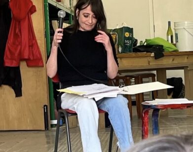
When Williams finished on Sunday morning, we sat down to speak with her about painting practice and architecture.
ANTWAUN SARGENT: How did you conceive this particular project?
AMANDA WILLIAMS: It’s one of these things that unfolded over a period of years. The genesis really started with the color palette, which I probably had a year before. I was thinking about advancing my painting practice and at the same time trying to infuse architecture back into my overall practice. Architecture and painting had been very separate for me.
SARGENT: So abandoned buildings became your canvas?
WILLIAMS: I couldn’t get my head around what I was trying to do with painting. All this thinking was going on parallel to this ritual I have of driving around the Southside of Chicago, and looking at the ways the landscape is changing—things going and coming, and streets that were once vibrant have become busy again. I have seen whole corridors change. At some point painting at the scale of architecture came in as a question. Then I started to think about the typology. I asked myself, what is black space?
SARGENT: Did you find an answer?
WILLIAMS: This is question, I have been asking for 20 years. I have gone back and forth between two mindsets. One being, is [black space] just space where a predominance of African American people live? Or is it expansive and does it have recognizable features that are spatial and experiential? I still never landed on what it is, but I keep on trying to press the question by doing these projects over and over again.
SARGENT: The names within the color palette takes me back to specific moments I had growing up in Chicago, using the products in which you based your color palette. How did you come up with the color palette?
WILLIAMS: I was having a conversation with a friend and thought about the idea of color theory because I teach as a seminar at Illinois Institute of Technology, and joked that I was also an expert on colored theory. [laughs] Then we were like, “Well what would the colors be?” For example, the first one was “Currency Exchange” because I was trying to think of a piece of architecture with which you would associate the color first and not the form. We eventually came up with eight.
In a city like Chicago where we have Mies [van der Rohe], [Louis] Sullivan, and Frank Lloyd Wright, and iconic architectural forms, none of that is readily associated with the South side or places that are predominately African American. Even though there are places with those kinds of houses, that’s not what people imagine when you say “black space” or “urban space.”
SARGENT: The buildings function as public art works on sparsely populated city streets. Why was it important for you to make this work publicly?
WILLIAMS: I didn’t want to speculate about what the works would mean. I wanted to do this at a scale I couldn’t control and in this public manner that forced me to receive conflicting input about what these buildings are. For as many people that love the project, there is that many people that hate it. There are also people who understand it on a conceptual level and there those who receive it on a very basic aesthetic level.
SARGENT: What has the community response been to the houses?
WILLIAMS: The assumption is that the community would either really love it or hate it. The reality is they don’t really care. They are desensitized to it—and their readings of the work are valid too. One man asked me, after we completed the final house, was it going to be a haunted house for Halloween? [laughs]
SARGENT: A few of the buildings you painted have been knocked down. What does that mean for the project?
WILLIAMS: I was thinking of the building itself as an object. I was thinking, if history itself was going away, is there something I could do as an architect to mark this thing at the end of its life. Is this final mark a way to acknowledge that these buildings were important? So I purposely picked houses that were slated for demolition to inscribe into the cultural memory in a way that is loud, that these buildings hold histories of the people who lived there, and that my project should be apart of the narrative too. The project really represents an interruption because it’s not a blank slate.
SARGENT: There is also a vibrancy of color in your paintings, like We Have Everything The Same, and there’s a “New Port Cigarette” blue in Pretend Is Water, Real Is This. Are there consciousness connections between the colors used in your paintings and in “Color(ed) Theory”?
WILLIAMS: The idea behind We Have Everything The Same is about inserting the panel of the house into the canvas, and thinking about this idea of memorial or monument—do you deify these things? And when it’s all gone and you only have one panel or doorknob, why does that become so special in our collective memory? Now it’s time to return to painting and harness that, and contemplate color in relationship to painting again.
AMANDA WILLIAMS’ “COLOR(ED) THEORY” IS ON VIEW DURING THE CHICAGO ARCHITECTURE BEINNIAL THROUGH JANUARY 3, 2016. FOR MORE ON THE ARITST, VISIT HER WBSITE.