Masha Ma Plays it Cool
By
September 23, 2010
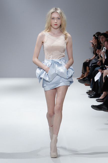
Masha Ma’s Icebreaker show, part of the Vauxhall Fashion Scout program, was a refreshing relief during London Fashion Week’s sugar rush of blinding, bright colors and hyper-happy collections. She presented draped origami-folds, flowing asymmetrical layers, and a subtly shimmering Arctic color scheme. The Chinese-born recent Central Saint Martins graduate combined faint shades of mint silk with silver foil, overlaid canvas, and lots of sculptured white forms into pieces that were at once graceful, smart, and uncommonly sexy. The show was cool, in all senses, and very warmly received by editors eager for a delicate palette cleanser after all the confectionary catwalks.
ANA FINEL HONIGMAN: Please describe the concept of the collection, and your choice of materials.
MASHA MA: The debut show looks at strong elements such as silver and steel juxtaposed with the intricate elegance found in the use of the finest cotton, draping and finish. Inspired by rugged buildings in the meatpacking district in New York City, the collection is industrial chic with a touch of subtle futurism. The chosen materials reflect the influence, silver foil cotton combined with white delicate silk crepe. An industrial touch on something delicate yet modern.
HONIGMAN: London Fashion week seemed overwhelmed by color and frills this season. How do you interpret this trend? Do you think its some reactionary response to recessionary blues?
MA: I think my interpretation of the season’s mood could be seen in my color palette. White, ice blue, a touch of blush and a speck of silver is the color palette; pastel while still being sharp. The collection was summer and minimalist, layering with an edge. I personally wasn’t really thinking of the recessionary blues, however I did want to represent something fresh, positive and clear, focusing on a brighter future.
HONIGMAN: White is a color with contradictory connotations in Chinese and Western culture. It is a memorial color in China, isn’t it? Does this tradition have any relationship to your choice of palette?
MA: You could say that it is part of the tradition. For me white is the color that represents summer and it really is the best way to show tailoring and layers.
HONIGMAN: Your work really reminds me of Mario Schwab. Was he and influence? Who are the British designers whose style or career inspires you?
MA: After working with McQueen, he remained the one that always influences me. I learned an incredible amount in my time with him. I also have to mention Louise Wilson, she continuously encouraged me and still inspires me.
HONIGMAN: Why did you keep most of the color on the bottom pieces, like the silver or mint skirts?
MA: I wanted to make sure the collection remained subtly futuristic, I felt too many bright pieces on top would have taken away the feminine touch and made the whole thing a bit too space age.
HONIGMAN: How has training at Central Saint Martins shaped your aesthetic or your design approach?
MA: Personally it thought me how to bring something very elegant into my work yet remain edgy.
HONIGMAN: You’ve had work featured in leading Asian and European publications. How are your designs styled, regarded and worn differently here and there?
MA: No matter where the publication originates from I always love seeing how other creative people style or interpret my designs. It is amazing to see how the pieces that were so set in my mind take on a whole other life when styled in these magazines.