Artist Christopher Williams Uncovers the Ordinary Beauty of A Pair of Shoes
For some artists, a pair of shoes could mean a number of things: style, mobility, utilitarianism. For Christopher Williams, a pair of shoes is just a pair of shoes—and that’s the point. “I’m interested in conventional, ordinary, normative images,” Williams tells me as we wander through the David Zwirner uptown gallery, a white-walled townhouse on the Upper East Side. “Images that belong to the public imagination.” His exhibition, Footwear (Adapted for Use), temporarily closed due to Coronavirus, is a dialogue between East and West, between ad and consumer. The artist, who has for the last 12 years split his time between the US and Germany, takes relics of Cold War-era Germany—a photograph of standard dress shoes, stucco-esque wallpaper—and mashes them up with artifacts of our modern, global world: an African mask sold on eBay, an IKEA-inspired photo shoot. Three additional titles—How German Is It, One American Photograph, and Standard Men’s Insoles (Adapted for Use) can be seen as “mistakes,” as the artist writes in his Open Letter introducing the exhibition—meanings that both obscure and illuminate his language of the ordinary. But make no mistake; if you happen to hop in a taxi one of these days and hear an excruciating beep on the TV monitor, it’s the fault of Williams.
Below, the artist walks us through the gallery, so you don’t have to even put on a pair of shoes.
———
All images courtesy Christopher Williams and David Zwirner.
“I’m interested in conventional, ordinary, normative images—images that belong to the public imagination. For the last 12 years I’ve worked between the US and Germany, where I have a studio in Cologne and teach at the Kunstakademie Düsseldorf. I move between both cultures, both in terms of language and in terms of images. For this show I wanted to construct a period piece, with the materials and surfaces of Germany in the early ‘70s, but filtered through my specific relationship to German culture and history.
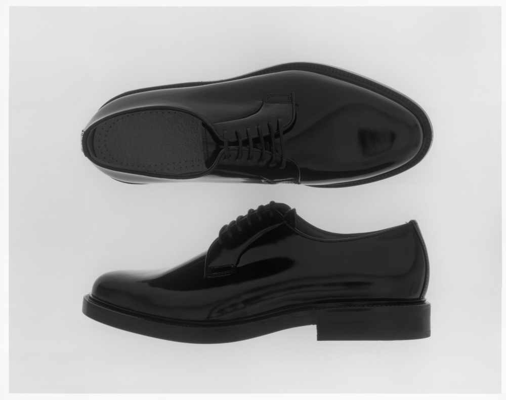
This is the photograph of shoes, the most standard dress shoes worn by German businessmen. The image is based on an advertisement I found while flipping through an in-room hotel magazine. The original image actually consisted of two photographs. Because of this, each shoe had its own optical center and had a different shape. I had the idea of remaking that photo with one center, suspending the shoes in space and montaging them together already through the set construction. It’s an analog photograph, so there’s no digital interface at any point.
One of the things that appealed to me about this was the fact that the room is reflected in the shoes. Every shape that you see in the surface is a reflection of what’s around it: the lights, the camera, the backdrop. Most product photography is either manipulated so that you don’t notice these surroundings, or it’s removed in post-production. I wanted to leave it as recognizable shapes, so that it’s also about the room that the photograph is made in.
All of my work is positioned within very conventional, traditional terms, and there’s a reason for that. I’m not interested in personal expression. Almost everything I make is based on something else. Since the ’70s, I’ve been studying camera magazines, travel magazines, coloring books; newsstands have been an extension of my studio. I learn a lot by looking at magazines because that’s how different groups within our culture represent themselves to the world.”
———
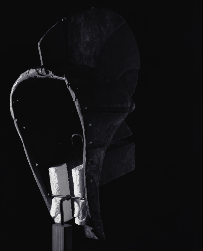
“I think that the meaning of a photograph is provisional and not solely contained within it, but rather that meaning is produced by its use in the world. Various things come into play. One is the context of presentation. This is a mask from the Congo. It was never in ritual use; it was never used by Africans for their sacred events. It was produced for the market here in the West. This one cost a couple of hundred dollars on eBay and it’s circulating through another system that is different from the purchase and display of African artifacts at the Met, let’s say. It’s an entirely different audience. So here you have a pair of very standard German shoes next to an African mask that is a commodity sold on eBay. The photographs are presented in very specific 70s-style frames, on walls with wallpaper from Cold War-era Germany. Displayed in a commercial gallery in New York, they are viewed in a very different context than a hotel magazine or for an eBay sale.”
———

“Here you have a family sleeping, and, as I said, my research is in looking at magazines and publications, IKEA ads for example. I was trying to develop a vocabulary of inactivity: rest, repose, sleep. In IKEA ads, you see families, either at play or at rest. In the last eight years or so, those fictional families have been very diverse. I was also thinking about advertisements for health insurance and places where this could be seen as a new typical family in the context of advertising, though maybe less so in reality.
The models in this photograph are skilled at the art of producing the appearance of sleep. This was a three or four day shoot where they had to lie completely motionless and pretend that they were asleep. It’s very hard for a kid that age to do that. What interested me was constructing a picture with three distinct planes of focus. The parents are in progressive levels of unsharpness, and then the child is in sharp focus. I’m interested in the idea of addressing the ideology of focus, and I picked what I would consider a common or normative picture of our desired political formation. Then I chose to represent one of the models in sharp focus, which seems to underline this kid and privilege him.
But to speak about one thing we remain silent about another thing. If I choose to underline the child, then he seems to be the subject of the picture. Why is it that we don’t privilege out of focus subjects? Could the image be about the father, or the mother? What kind of conclusions do we draw from the father being the furthest away, lacking definition, being relegated to the furthest point in the frame?
An alternate title of the exhibition is “One American Photograph,” but these are German models. They’re wearing East German pajamas, and the sheets and pillows are a combination of East and West German products. So nothing in this picture is American, except for the person who constructed it. But I’m also using the historical divide between East and West Germany to frame our current cultural reality within a very ideologically divided America. The space of negotiation has slipped away; we’re taking hard positions and yelling instead of discussing with each other. That’s why the subject of Cold War Germany seemed useful to me at the moment.”
———
“This is a film, 30 minutes in length, the subject of which is a paste-up. Paste-ups were a technique used in publishing, before digital formatting, where you would have a piece of paper and cut out all the elements and use rubber cement to lay them out, making notations to guide how it should be printed. I made this for the advertisement of the show, even though they didn’t actually print it from that, since magazines don’t use analog printing processes anymore. All of Barbara Kruger’s early work was produced with this technology. It’s just what everybody used. So I made a representation as if this were the late ’60s or early ’70s and we were producing this paste-up in Germany. It’s a fiction. It’s part of a series of films I’ve been making of printed matter as the sole subject that I call Provisional Props. This is shown on an ’80s television. These films are made with very high resolution, but we’re showing them on substandard vintage televisions, so they have this other kind of look.
The recurring tone is a technical sound that you use for calibrating sound and for designating the end or beginning of a film. In former times, they would stop broadcasting at around 1:00 in the morning, and this sound was used at the end of the broadcast day. When the late night shows were over, there would be this tone and sometimes a logo or a clock for the broadcaster. And then it would go to snow. Johnny Carson would end his monologue and then you would hear this tone, which for people of a certain age, still signals this kind of sleepless late night thing.
We’ve also presented this film in taxi TV. Last night I had dinner downtown and I jumped in a cab and within three minutes the film was playing, with the tone as well. The first thing most people do in a cab is hit the button to try to mute the sound because it’s really annoying when you jump in the cab and maybe you’re talking on the phone and then Jimmy Fallon is talking to whoever, so you hit it. And this one is really annoying because it goes weeeen and you hit the screen because you think it must be a mistake. If you want to know what the drivers think of it, we should talk to Brady who works in the office next to this room. She has to listen to this tone every half hour … The drivers must hate it.”
———
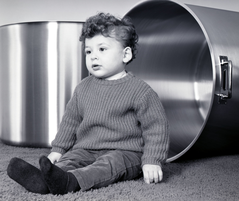
“This photograph was originally made for the Frieze Art Fair in New York, where I framed David Zwirner’s booth as a stage set, with their sales staff as the cast. The photograph juxtaposes basic elements—the pots, the carpet, and the kid—which I asked them to use as an improvisational structure for discussing the work with prospective clients. The photograph was re-functioned as a playscript for the sales team.
The image is a hybrid of the lexicon of IKEA and social realism. Initially it may seem like a classical children’s portrait of the kind taken at the mall, but the level of image quality contradicts that. It was shot with large formal analog film and printed using historic darkroom chemical recipes to achieve a wider tonal range. This attention to detail, and the low, monumentalizing camera angle, lend him a level of dignity not normally given to young children. He becomes a kind of public figure, like one of Bertolt Brecht’s characters. The angle changes it just a little bit.”