Gap Turns Widely Heckled New Logo into â??Crowd Sourcing Projectâ?
By
October 7, 2010
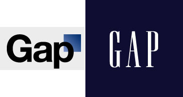
Gap, the 84th-most-valuable brand in the world, quietly debuted a new logo on its home page earlier this week, without releasing a formal announcement that they were rebranding. The new logo, in a heavy black Helvetica against a white background, with a blue gradient square in the upper-right corner, replaces the iconic white-on-blue Gap logo the company has had for over 20 years. As Ad Age explains, the new logo was immediately torn apart online by design enthusiasts; a new Twitter, @gaplogo, has even sprung up in protest. (Sample Tweets: “John Mayer isn’t even taking my calls anymore,” “The first person who dresses up as me for Halloween gets a $20 gift card to American Apparel.”)
In response to the chatter, Gap issued a statement on its Facebook page last night: “Thanks for everyone’s input on the new logo! We’ve had the same logo for 20+ years, and this is just one of the things we’re changing. We know this logo created a lot of buzz and we’re thrilled to see passionate debates unfolding! So much so we’re asking you to share your designs. We love our version, but we’d like to… see other ideas. Stay tuned for details in the next few days on this crowd sourcing project.”
The company hasn’t responded to Ad Age‘s request for comment, and it’s unclear for now whether the “crowd sourcing project” is what it appears to be—a desperate act by a desperate marketing team—or whether there’s more to the story. But lots of designers aren’t taking the bait. Most of the comments on Gap’s “crowd sourcing” post fall along the same lines as Joshua A. Laney’s response: “What a shitty, shitty thing to do. You want a new logo? Quit asking for free designs (and I pity the designers who fell for this and sent serious submissions) and hire a professional designer/firm to create one for you.“
And here’s an especially concise reaction, offered by one Mr. Charlie Triplett.