Set in Stone
Last week, Central Park received a new piece of statuary courtesy of the Public Art Fund and delightfully droll British artist David Shrigley. Shrigley is best known for his painted works, which are like single-panel comics, and feature blunt phrases (“CUT OFF YOUR REDUNDANT PARTS,” “GOING NOWHERE”). For his first major piece of public art, he went 3-D and embraced one of art’s more misunderstood forms: the public memorial.
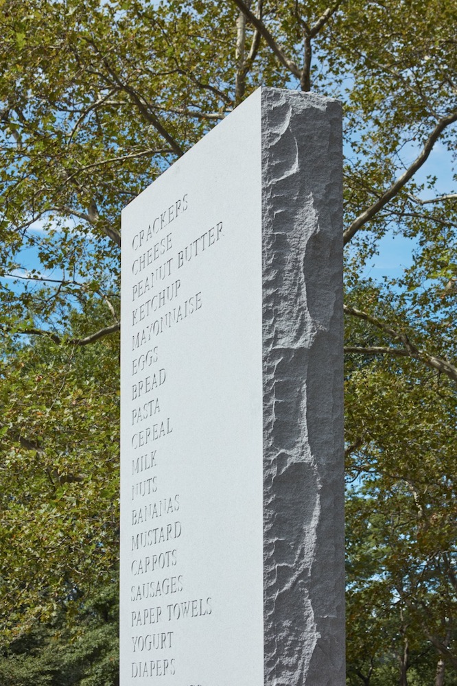
Situated in the middle of the genteel and generic Doris C. Freedman Plaza, Shrigley’s sculpture rises out of the ground—a 17-foot-tall granite shopping list (Cheese, Yogurt, Tampons, etc.). MEMORIAL can be viewed a lot of ways: as funny and subversive, turning the somber tradition of stone monuments on its head; as heroic, celebrating the everyday; and as more than a little wistful. It makes us think of those we’ve lost, and all the unremarkable moments they’ve left behind.
MATT MULLEN: I got a chance to see the piece this weekend and it was everything I hoped it would be. My first question is: What was your hope for the piece?
DAVID SHRIGLEY: I guess I hoped that it would look like it did on the computer rendering. And then it did. [laughs] The rest is all about context.
MULLEN: What kind of context were you envisioning?
SHRIGLEY: That space, the Doris C. Freedman Plaza, is the sort of space where you might expect to see a monument, or a wall memorial. With the text and all, it doesn’t look out of place as an object in that space, as a piece of furniture in that space. But my project is sort of a comic one; there is an element of comedy and surrealism. Then again a memorial, I suppose it’s a melancholy thing. One is primed to think of people who have passed when you look at a memorial. So you start to wonder how that list relates to a memorial for a person. And in that sense it could be quite a melancholy thing.
MULLEN: How did the commission first come about?
SHRIGLEY: I started having a discussion with [the Public Art Fund] about making a piece around four years ago. I was in New York for an exhibition, we had a meeting, and I wandered around town and looked at various different spaces where sculptures have been shown before. But of course the wheels turn slowly when you’re trying to get permission for these kinds of things. In fact, I’m sort of surprised that it’s happened. And it’s also kind of odd that it’s happened in the same month of another really big public sculpture that I’ve been working on [for Trafalgar Square in London].
MULLEN: When you compare the sculpture to your drawings and paintings, it seems like quite an aesthetic departure. In my head I imagined the font of the shopping list items was going to be in your signature handwriting, but instead it’s in this rather formal serif font.
SHRIGLEY: I think people are quite surprised that the handwriting I use in my drawings and paintings is my own handwriting. They’re slightly shocked when I write them a letter. Albeit I use uppercase in the artwork. So they’re like, “Wow, that’s your real handwriting!” And I think, or I say, “Yeah, what else would it be?” [laughs] But I suppose the way I would respond to your observation is that making drawings with text in the first place, it really was born of a desire to be economic, and to do things as simply as possible, and to do as much as I could by the most economic means. So in that sense the handwriting itself isn’t really that important, and maybe if I had graduated from art school 15 years later I might be using something different, rather than just drawing on paper, on account of digital media and everything. I feel quite comfortable and happy with making a work that looks like it could have been made by somebody else. But I think the thing is there’s a context, and it would be odd perhaps to think about using my own handwriting, because the vast majority of people who would see it are just not really aware of my oeuvre as an artist, so it would just pass them by. So it just seemed appropriate to use a font like that. I think the thing is there’s a work for every space, you always have to respond to a context, whether it be a physical context, or a political one, or a cultural one, whatever. I’m always interested in doing that. And if the work jells a little bit in terms of being placed in the oeuvre, I don’t care—as long as it works.
MULLEN: I think it totally does work. This font is part of the package. How did you choose the list of shopping items? Was that hard to do?
SHRIGLEY: It was harder than you might imagine. It occurred to me that it had to be an American shopping list, because there are items that one buys in the U.K. that one wouldn’t buy in America. So I invited my colleagues at the Public Art Fund, and at Anton Kern Gallery to show me their shopping lists, and I did a composite of them. And then I showed it to Amanda [Singer], who was working on the project at Anton Kern, and Amanda’s observation was that it was a little too Whole Foods. [laughs] So I was like, “Well, I want it to be more of an everyman shopping list,” so we swapped out a few of the fancier things, like rice wine vinegar, for ketchup.
MULLEN: Right. Because if the list is too fancy the viewer might feel alienated.
SHRIGLEY: I think people should once a year buy everything on that list.
MULLEN: It’s a great list. Nutella is an essential.
SHRIGLEY: Yes. And shelf brackets, don’t forget those.
MEMORIAL WILL BE ON VIEW AT THE DORIS C. FREEDMAN PLAZA, CENTRAL PARK, IN NEW YORK THROUGH FEBRUARY 12, 2017.