VINYL
How the Design Collective Hipgnosis Reinvented the Album Cover
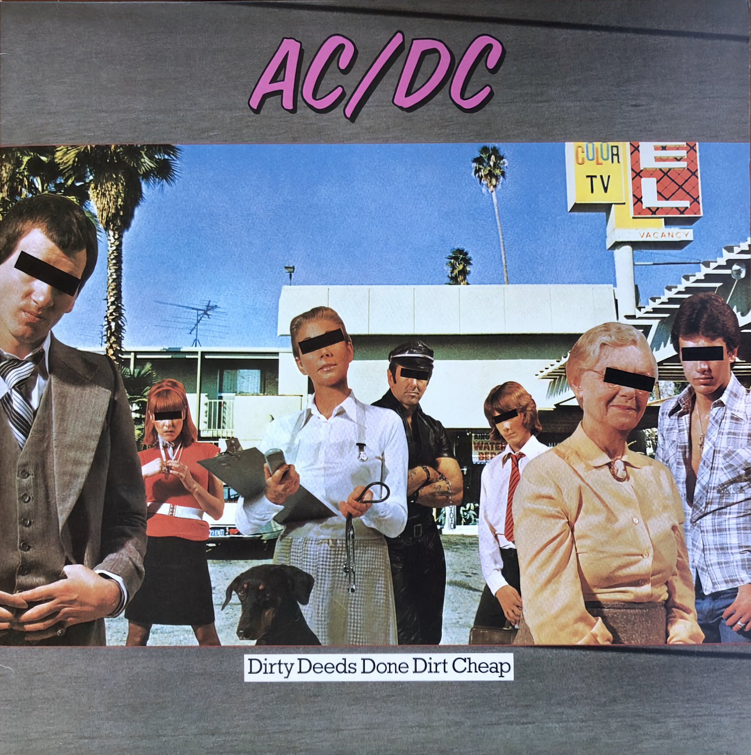
In the heyday of the record sleeve, music was a much more aesthetic pursuit. Few people understood this better than Aubrey “Po” Powell and Storm Thorgerson of design collective Hipgnosis, whose iconic, pop-surrealist cover artworks vivified the trippy rock albums of the 60s and 70s. “It’s so striking in its simplicity. I mean, children can love it. I think it’s the most recognizable album sleeve of all time,” says director Anton Corbijn of Dark Side of the Moon, the Pink Floyd album whose cover art is now so ubiquitous you’ll find it on pins and t-shirts at Walmart. In Corbijn’s new documentary, Squaring the Circle (The Story of Hipgnosis), fans get a look into the wild stories behind some of their favorite throwback covers, from AC/DC to Zeppelin. Following the film’s release, Corbijn and Powell joined us on Zoom and Powell shared some anecdotes about inflating footballs in the desert and setting men on fire, all for that perfect shot.
———
PINK FLOYD | A SAUCERFUL OF SECRETS (1968)
“Pink Floyd were friends of Storm and myself from Cambridge, and they’d just really started out. They were talking about their next album cover and Storm said, ‘Why don’t you let us have a go?’ Cause we’d been experimenting with infrared photography for book covers. In those days, Pink Floyd was an underground band in London that played what they used to call space rock, so we knew it had to be a montage of various elements. If you look at the cover, it’s got Doctor Strange from the Marvel Comics, alchemical imagery, space imagery, it’s a mélange of different things that represented Pink Floyd at the time. I worked it out in the darkroom by printing various different images and masking off with my hands, using different negatives, stuff like that. After days of trying, I came up with the end result, which I then hand-tinted with inks, a very old Victorian style of making postcards. The text is a simple letterset I bought from a news agent that you just rubbed on with a pencil. It was so amateur, but it was the start of our career.”
———
PINK FLOYD | ATOM HEART MOTHER (1970)
“We were sitting around trying to think of something different for Pink Floyd and somebody said, ‘Why don’t you put something incredibly mundane and ordinary on the cover?’ Something very Dada-esque, like Marcel Duchamp’s urinal, and somebody suggested a cow. So Storm and I drove out to North London where there were some fields and found beautiful cow, actually called Lulubelle III. We jumped out the car, took some pictures, and somehow got an extraordinary photograph of a cow looking straight at us with a rather amused look. Blew it up in the darkroom and took it to Abbey Road Studios and the band went, ‘Yeah, that’s it.’ No name on the cover, no title. And that kind of lateral thinking worked incredibly well at Tower Records, where you had 10,000 albums and this one stood out a mile. There’s something poetic about the simplicity of it.”
———
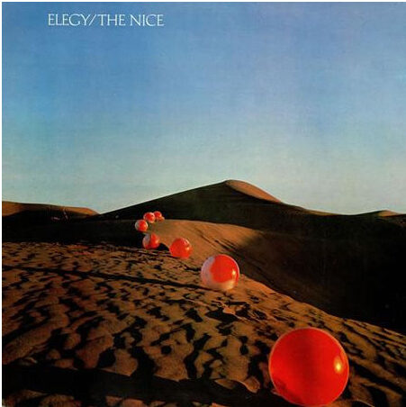
THE NICE | ELEGY (1971)
“It was the first time that Storm and I realized that we could have an album cover that was a piece of land art. I went to see Keith Emerson, who was the leader of the band, and he loved it. But the record company looked at me in surprise, and the little sketch I had, and they said, what? You want to take a hundred red footballs to the Sahara Desert? It was unheard of in those days. Most album covers were a picture of the band shot in a studio in London. We had support from somebody in the record company, so the next thing I knew, we were on a flight to Marrakesh and heading out towards the Sahara Desert with a bunch of deflated footballs, looking for a location. The only problem was we only had a bicycle pump to inflate the footballs, and we realized that each one took 20 minutes. So we managed to hire some young Moroccan men overnight with a bunch of pumps to pump the whole lot up. We laid out 60 footballs in the desert, and I was so naive that I took a broom from London so that I could sweep the footprints away from the balls. It was incredibly amateur but the photograph is beautiful and it was the first time we really went somewhere exotic to make a picture like this.”
———
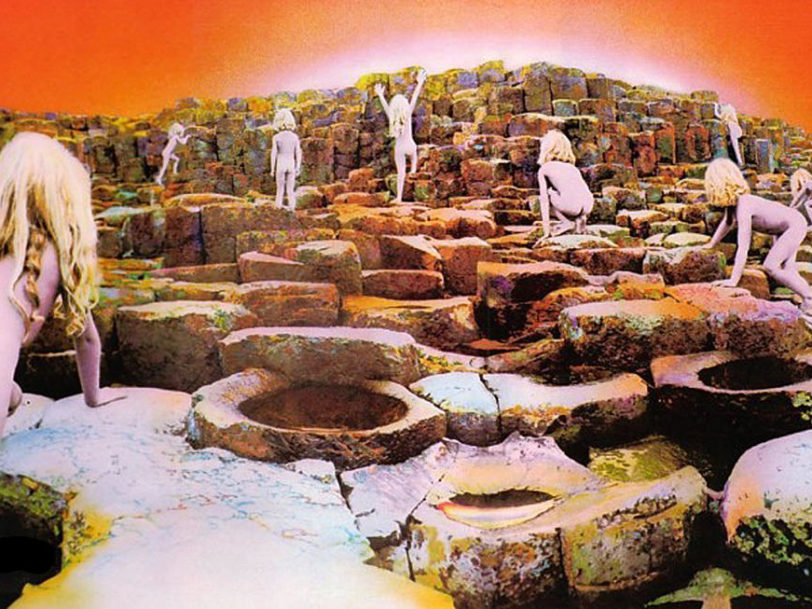
LED ZEPPELIN | HOUSES OF THE HOLY (1973)
“It was influenced by Arthur C. Clarke’s Childhood’s End. At the end of that book, all the children on Earth go up in this spiral of fire into the heavens to escape the overlords that were about to rule the Earth. Storm and Jimmy Page and Robert Plant from Led Zeppelin had all read the book. So when I went in to present this idea, which was sketched out on the back of a cigarette packet, they got it immediately. I wanted to do it at the Giant’s Causeway in Northern Ireland because there’s some wonderful rock structures, and at dawn or dusk to catch this beautiful sunlight. Originally it was going to be a mother, father, and two children all naked and covered in gold and silver paint led by a kind of Silver Surfer character, very science fiction. When I got to Norther Ireland, it absolutely poured with rain and was ice cold. So I had to think on my feet, and I shot the kids on the rocks in different positions, and when we got back to London, cut them out and collaged them all together and had them hand-tinted, since I didn’t have a sunset or a sunrise. When I showed Jimmy Page and Peter Graham, the manager of Led Zeppelin, I was nervous because it was not exactly what I’d sold them, but Jimmy loved it. I showed him the inside cover, which is a sacrificial image of a man holding a child in Dunluce Castle, an old ruin in Northern Ireland. And he said, ‘Well, I think that should be the front cover.’ So we had an argument, and in the end, we decided on this image, but it was by the skin of my teeth. Of course, you couldn’t do an album cover like that now. The mother of the children was there, and it was a very carefully contrived image, not to be offensive in any way. It was done out of innocence and it was taken from the Arthur C. Clarke book.”
———
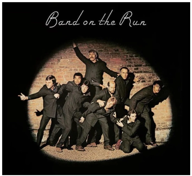
PAUL McCARTNEY and WINGS | BAND ON THE RUN (1973)
“When a Beatle calls you up the year after they broke up, you went, ‘Yes, please, I would like to work for you.’ Because Paul McCartney was god to us at that time. He said, “I don’t want you to design anything. I want you to be an art director for us. I want you photograph my idea, which is a bunch of people escaping over a prison wall.” And I have to say, in a way, we sold our souls to the devil because we knew being associated with Paul McCartney would help our career. And he was so pleased with that image. You see in the film that it became a relationship for the next 20 years. I really enjoyed working for Paul. It was a bit like working in art school. Everything was sort of cutting up bits of paper and sticking things and scribbling on notepads.”
———
PINK FLOYD | DARK SIDE OF THE MOON (1973)
“It’s been 50 years this year actually, and it stood the test of time so well. It’s still absolutely all over the shop, which is very flattering. But initially when we went to ask the band about doing the new album cover for Dark Side of the Moon, they were very dismissive of some of the previous work we’d done for them and wanted something more graphic and simple, like a chocolate box. And that was not our style at all. But I was looking through a book about refraction of light and Storm suddenly said to me, ‘I’ve got it. We should do a pyramid with a refraction going through it. And that would sum up Pink Floyd.’ And it did, because in those days, Pink Floyd’s live shows were all about lighting and effects. In fact, you rarely saw the band. They were all in darkness. I think David Gilmore used to play most of the concerts with his back to the audience. So the idea just gelled with them. It’s so simple and so un-Hipgnosis, because we were known for photo designs, not for graphics. But it led to Storm suggesting we need to go to Egypt and shoot pyramids to add to the enigma of the whole album. In those days people just said yes. Money was no object. So off we went to Egypt, took some photos, and then you had the whole package. It created quite a roar at the time, people were wondering what it was. But most importantly, the album was probably one of the greatest albums ever made. I can’t claim that the cover had anything to do with the recording, but I can claim the cover probably helped sell the album.”
———
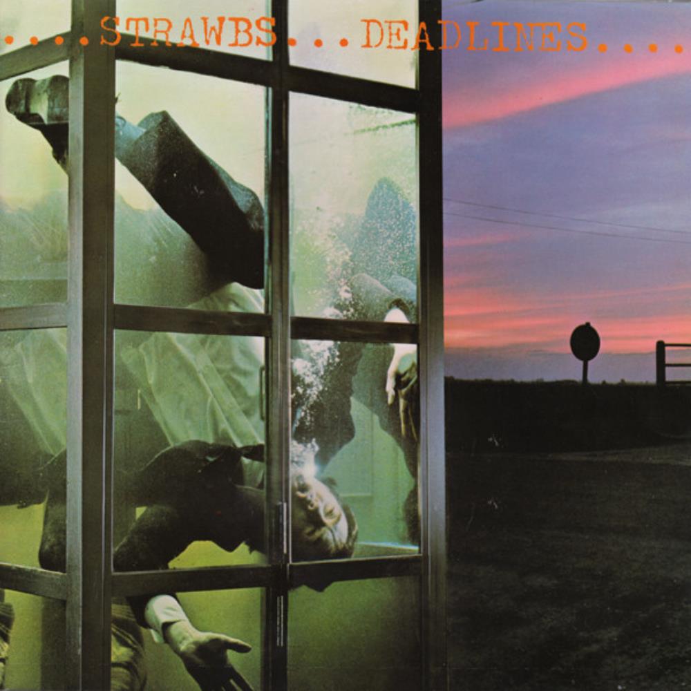
STRAWBS | DEADLINES (1977)
“We came up with an idea of a rather surreal image of a man in a phone box in the middle of nowhere, and the phone box filled up with water. For why, for what? Who knows? What’s the narrative here? We don’t know. A typical Hipgnosis surreality. But the worst thing was that when I put the guy in the phone box, he was upside down and he nearly drowned. And then one of the panes of glass broke and nearly killed him. So we had to do it all over again with reinforced glass and something with a little more safety in mind. But we got the shot in the end, and it’s one of my favorites because it’s a really weird picture.”
———
PAUL McCARTNEY and WINGS | VENUS AND MARS (1975)
“I was mortified because we flew to Los Angeles to meet with Paul and he had this idea to put two pool balls on a table and that represented him and Linda. And I’m sitting there with Storm, looking at his face getting darker and darker, and he went, ‘Well, you don’t need two of us to do that. Po’s the photographer so he can shoot that. I’m going back to England.’ I thought, ‘Oh my God, we’ve blown it completely.’ But Paul looked at him and said, ‘Okay, we don’t need you. We’ll work with Po.’ And I carried on. But Storm had the audacity to walk out on Paul McCartney, and that required a lot of guts because we could have lost Paul McCartney as a client and a friend, but we didn’t. After that, Paul wouldn’t work with Storm. It comes through in the documentary that he could be rude and abrasive, but he was like that. Until then, it was a great relationship.”
———
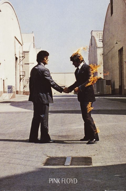
PINK FLOYD | WISH YOU WERE HERE (1975)
“One of my favorite album covers. The idea was all about absence. It refers to the loss of Syd Barrett, who’s the original author of many songs for Pink Floyd, and who went mad from the use of LSD and had to leave the band. It also refers to insincerity within the record company, which was rife at the time. I mean, Pink Floyd walked into Capital Records and the head of Capital Records said, ‘Which one of you is Pink?’ That’s how divorced from reality the suits in the record companies were from their artists. All they were interested in was creaming the profits. And they wanted one hit after another. And Roger Waters took great exception to that. The front cover is two men shaking hands and one is being burnt in the deal. And I remember when Storm presented it to the band at Abbey Road Studios, he got a round of applause. David Gilmour said, ‘So how are you going to set a man on fire?’ Because in those days there was no Photoshop. And Storm just turned to me and said, ‘Well, Po’s going to set a man on fire.’ So I did. I went to Hollywood, found a stuntman and set him on fire. And to me, it’s one of the great pictures of Hipgnosis. It’s really a striking image. And it was shot for real, which was important.”
———
UFO | OBSESSION (1978)
“First of all, the original idea was taken from a job we did for a Japanese magazine about ball bearings. We thought it would be rather good to use it for UFO. So I went to Los Angeles and shot the band in a veterinary surgery, and did the same technique with them, with Michael Schenker, who was the lead guitarist, in the center without the ball bearings. When we finished the album cover, we were all looking at it in Hipgnosis Studio and Michael suddenly said, ‘Why is it I have no balls?; To which of course everybody cracked up laughing. It summed up the rock and roll era of heavy music of the day.”

