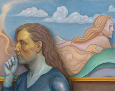
Vaughan Oliver
In the early 1980s—before the notion of “alternative music” would become a cultural commodity sold to disaffected teenagers—there was arguably no more important or consistently groundbreaking record label than 4AD. Founded in 1980 by Ivo Watts-Russell and Peter Kent, the British indie label made a name for itself not only for introducing the world to the likes of Cocteau Twins, Dead Can Dance, Pixies, and Throwing Muses, but also for establishing a distinctive visual identity that proved to be as influential (and often as inscrutable) as the music itself. That was all thanks to the work of little-known British graphic designer Vaughan Oliver.
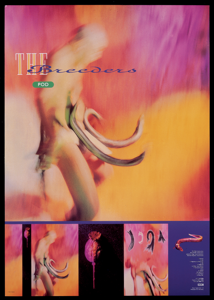
For those music obsessives who valued the physical object of an album as much as the vinyl inside the sleeve, Oliver’s work transformed two pieces of glued cardboard into art objects. His painterly aesthetic is typically characterized by a dark, Lynchian atmosphere paired with surrealist imagery (often shot by photographers Nigel Grierson and Simon Larbalestier), abstract uses of typography, and evocative textures. And though the bands on 4AD’s roster in its early years greatly varied in sound (there is no confusing This Mortal Coil with Colourbox), Oliver created a kind of cohesive visual language that not only distinguished the label’s growing catalog, but quietly influenced a generation of graphic designers and visual artists. Other than perhaps Peter Saville and his work with Factory Records in the ’80s, no other label enjoyed the type of symbiotic relationship with a designer that 4AD had with Oliver via his two design studios, 23 Envelope and v23. Thanks to his visual acumen, as well as his personal relationships with the bands, Oliver’s most famous record covers became palpable extensions of the music. Looking at the sleeve of Cocteau Twins’ seminal 1983 album Head Over Heels while listening to the music, one senses that the visuals are not so much an explanation of the songs as they are another way into them. They represent a kind of alternate universe from which the songs emanate. As singer Elizabeth Fraser’s otherworldly voice coos and trills in the background, you could gaze at the shadowy landscapes of Oliver’s design and think to yourself, “This is what music looks like.”
I called up the 58-year-old designer at his studio near London, where in addition to teaching graphic design to university students, he continues to create beautiful visuals for bands. We chatted about his work, his enduring love of music, and why he still considers himself a punk at heart.
T. COLE RACHEL: Do people seek you out a lot to talk about your work?
VAUGHAN OLIVER: I wouldn’t say a lot, but yeah. What’s interesting is that people are still interested. I’m flattered that there’s still a respect for the work that we were doing way back then.
RACHEL: I’m a record collector, and I probably own more of your work than any other visual artist.
OLIVER: And why is that? Was it because of the music?
RACHEL: Mostly, but the 4AD records were always so beautiful.
OLIVER: The music was fantastic, but then there’s the connection with the visuals as well …
RACHEL: I came of age at a time when people still bought lots of physical records, most of them on vinyl. So I had that relationship of going to a record store and looking at the packaging, and that was a big part of why I purchased a lot of the music I did.
OLIVER: Did you sometimes go for stuff where you hadn’t heard the music?
RACHEL: Oh yeah. I’ve bought tons of records based on the album artwork. I grew up on a farm and we didn’t really have cable television or college radio. I subscribed to music magazines, and that’s how I found out about bands. The nearest record store was an hour away, and I would go there maybe once a month when I was a teenager.
OLIVER: Did you meet like minds there? It was a social thing as well?
RACHEL: It was sort of like if you saw someone wearing a Siouxsie & the Banshees T-shirt, it connected you with them. That’s how you knew they were part of your tribe. It was the same with records. If you saw a new record out on 4AD, you’d buy it based on the knowledge that if they were putting it out, you’d probably like it.
OLIVER: That was the idea. This was kind of branding before branding—and I generally don’t use the word branding—but it was creating a vibe that made you trust in something. It was amazing because we were doing the Mystery of the Bulgarian Voices records, a Colourbox album, a Pixies album—it was actually quite broad, but somehow it all made sense on the label.
RACHEL: How did your relationship with 4AD begin? You were quite young, right?
OLIVER: Yeah. Somebody introduced me to Ivo about six months after he’d started 4AD, and we just got on. We used to bump into each other at gigs. So there was a kind of empathy, a common goal for what we wanted to do. I was just, “Oh give me a job, mate. You need an identity.” It was a very natural thing. There was no manifesto to it, but the idea behind the whole 4AD thing was to create something with a logo on it. “Oh, it’s the Cocteau Twins with the 4AD thing on the back? What’s this fucking Bulgarian Voices? What’s this fucking Wolfgang Press? I guess I’ll give it a shot.” I was only 20 years old. I was always a bit wary of putting an identity on the label itself, but I wanted individual identities for the bands that were consistent. Then, with time, you would see a thread start to appear. There was a unity, but without a corporate branding stamp on it. It was very fluid. Eventually, it became an emotional response that people had with the work. Thirty years later, I’m talking to students who call it “emotional branding”—how people become emotionally involved in what we were doing. I’ve got clients who ask, “How can we have that now?” I say, “We don’t have that now. It builds with time; it also builds with the quality of the product.” So I guess what I’m saying is, I was in love with the music, I was inspired by it. And Ivo, who was running the company, said, “Go for it.” The bands always had a say as well. Nothing was impressed on them. I always thought it was about really digging into the music and expressing the music as a visual.
RACHEL: I’m remembering listening to some of those records for the first time—literally sitting next to my stereo and holding the album sleeve and looking at it while listening. The visuals were certainly not a literal representation, but rather a kind of perfect visual accompaniment. Back then, how did you approach the work? Did you spend a lot of time with the music before you started?
OLIVER: Definitely. Back then, I had more time to do that. Say, I knew this record was going to be coming out in two months’ time, so I’d listen to the demos beforehand. I was part of the process. Nowadays, contemporary peers would say, “Fucking hell, what a luxury!” These days, we get called on a Friday and we’re asked to do a sleeve for Monday. It was never like that at 4AD. That’s a testament to how Ivo ran the place. He was putting out music that he loved. He was never a units man. And part of his makeup was, it’s got to look good and it’s got to express the music. So I guess I helped him in that way. I was actually his first employee at the label. That’s nuts! I did a little bit of warehouse work, but probably not as much as he wanted me to do. But, yes, there’s that whole fabulous thing of picking up a record and there is this object that’s a gateway into the music. You sound like you’re coming from the same place as far as that’s concerned?
RACHEL: Oh, yeah. I don’t want to call them fetish objects, but the way I obsessed about records, it really was about the whole package. And what was so great about the way that those 4AD records were presented was that there was such a mystique to it all. I remember hearing Cocteau Twins and This Mortal Coil while looking at those record sleeves and thinking, “Where is this coming from?” All of those bands felt like they were coming from another planet.
OLIVER: Did you also think there was space for your interpretation? That’s kind of what I wanted. There was an ambiguity and mysteriousness that allows the person coming towards it to interpret it their own way. I like the idea that it’s open-ended.
RACHEL: Totally. You could project your own thing onto them. Did you have personal relationships with a lot of those bands?
OLIVER: Of course. I’d go into the studio with them, hear what was going on. So this kind of relationship developed. I remember talking to Frank Blank, a.k.a. Charles Thompson from the Pixies, and he said, “You know, music really is just a mathematical formula. Successful music is just mathematics.” That broke my heart. I thought it all came from the heart. And even though I’ve been around musicians for years, I still don’t understand chords; I don’t know how they do it. All I’m into is the feeling that I get from it. So when he said that, I thought, “Oh, fucking hell.” And that led to Doolittle, which I thought was quite good. It took me back to the idea of Renaissance painting and having this idea of a formula or a template … What’s it called? The “golden section” or something that relates to painting? So I’m thinking, “Okay, I’ll stick some numbers and such over the fucking monkey on the album cover and away we go.”
RACHEL: [laughs] Like many people, I have such specific feelings about that record, because I remember when I finally bought a CD player after only having a record player and a tape player throughout my childhood, Doolittle was the first CD I bought. And that was when CDs came in those long cardboard sleeves.
OLIVER: Oh, right. It’s mainly packaging and then the CD at the bottom.
RACHEL: I remember buying that and saving the long box and putting it on my wall. Of all the records you designed, do you have any sentimental favorites?
OLIVER: All of them. Honestly. I wasn’t doing a job; I was in a place where I was getting inspiration. I was essentially making sleeves for my own record collection. I was in the right place at the right time. It wasn’t like being in a big record company; you were breaking new ground as a small independent record company. And it’s funny to talk about it so many years later. But at the beginning, it was like, “Fuck everybody else, we’re doing this!” But we were part of an independent distribution system, so we were kicking against the pricks, swimming the wrong way. We were an alternative, I suppose. When you’re young, you just want to do something different. You want to break the mold and work with bands that don’t want to have their faces on their sleeve. Thankfully, all of them said, “We don’t want to be on the sleeve; we want you to deal with the music.” And that was inspirational. And it’s not just about me; it was pretty collaborative with the photographers and the illustrators we worked with. It was a great time. And we wanted to change things. We didn’t want to join in; we wanted to stand out and fuck things up.
RACHEL: That early work became very influential. Was it weird to see the influence of your work on other designers?
OLIVER: Initially, yes, but not hurtful. Years later you see the influence in the mainstream—the use of texture and slightly obtuse work. That still happens today. You know what the funniest thing is? I’ve recently been cited in a book [Graphic Design Visionaries by Caroline Roberts] as one of 75 visionaries from the last 100 years of graphic design. I find that extraordinary. I’m not a visionary. I just wanted to do something different. At heart, I’m a punk. But in terms of the aesthetic, there’s a whole kind of 20th century eclectic influence. So there’s a romantic look. Did that answer your question? Sorry, I’ve had a glass of wine now. I’ve been lucky to work with all these amazing people, haven’t I?
RACHEL: Yeah, so many icons. I remember in college showing some of your record sleeves to my graphic-design professor and saying, “I want to do stuff like this!” And she was totally confounded by most of it. I showed her the Ultra Vivid Scene record with the toothbrush and Catholic stuff all over it. She thought I was nuts.
OLIVER: So it was provocative to her?
RACHEL: Yes, but I remember her saying something along the lines of, “This isn’t graphic design; this is more like fine art.” And it was the first time I ever thought about that distinction.
OLIVER: Well, to her I would say, “Fuck that.” To be honest, this is graphic design, and I don’t like when people make that distinction; it marginalizes me. I’m saying this is graphic design, this is what can be, and it’s emotional. I guess that’s kind of behind the whole thing for me—it’s emotive, it’s poetic, and that’s what graphic design can be.
RACHEL: I’d argue that graphic design is a much more powerful force within popular culture than what we’d now consider fine art, which exists in this other rarefied space.
OLIVER: I don’t see myself as an artist. I work with artists and collaborate with them, but then it becomes graphic design. It’s not an art. [laughs] I’m a graphic designer.
RACHEL: That must be a conversation that comes up a lot with your work, people who want to talk about it within a fine art context or define it as something “other.” You teach graphic design now; is this something that you try to impart to your students?
OLIVER: I think my strength in teaching and what I get a lot of good feedback on is going towards the students and asking them what they are about. It’s about putting your own personality into the work.
RACHEL: Are you still a music lover?
OLIVER: Yeah, but I’m not as hungry. You can’t be at almost 60, you know? What was fantastic about that early 4AD period was that the band would come into our studio and you’d have a conversation with them, and then you go out to see them perform that night. You’d go to a Pixies gig where they’re playing with Pere Ubu …
RACHEL: Oh yeah, of course.
OLIVER: The Pixies played two nights at the Forum in north London in 1989. The first night they played an amazing gig. The second night … Well, when you think of a gig, you think of the set as a playlist, as a cadence and a cascade, and how things work together. The next night they played the gig backwards, the whole fucking set list was backwards. They played the encore first. Right off. Came back on, and then did the whole gig backwards. It fucking worked. It was an amazing time. I’m so glad I was part of that.
T. COLE RACHEL IS A BROOKLYN-BASED POET, MUSIC JOURNALIST, AND CERAMIC CAT ENTHUSIAST. HIS BOOKS INCLUDE SURVIVING THE MOMENT OF IMPACT, AND BEND, DON’T SHATTER.