house tour
House of Acne Paper Is Your Crazy Fantasy Home
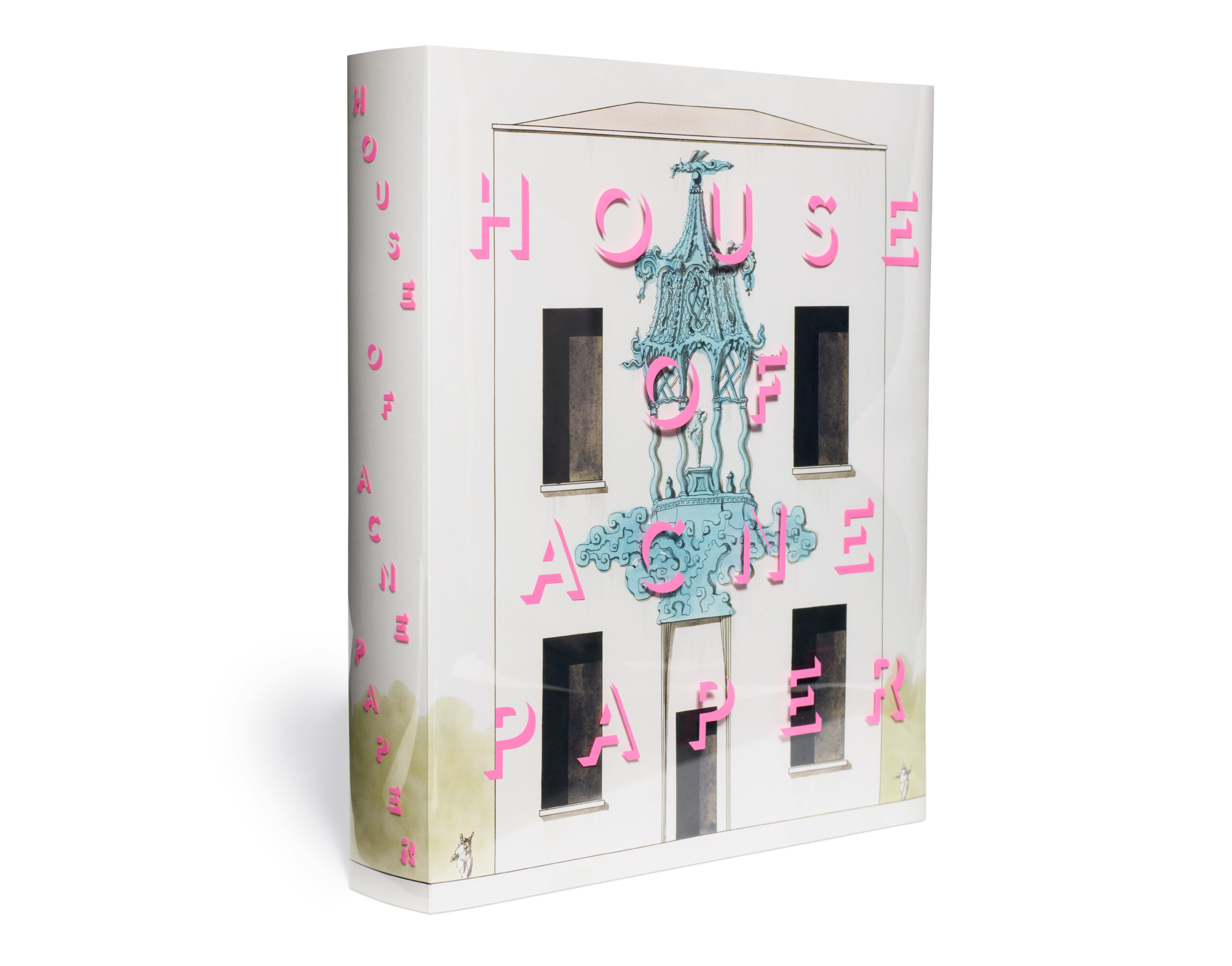
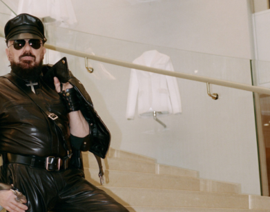
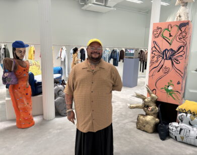
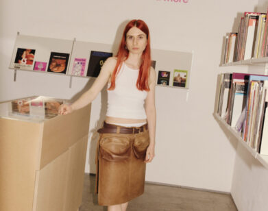
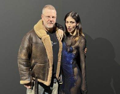
The latest issue of Acne Paper, the print publication of Swedish Acne Studios, is a sort of art-house book, in keeping with editor Thomas Persson’s desire to reinvent the magazine with each new edition. House of Acne Paper, the 18th issue, inspired in part by auction catalogues, is a 500-page interdisciplinary exploration of fantasy dwelling, divided into a structure of nine rooms and a garden each furnished with an eclectic collection of art objects, photographic stories, and conversational interviews with architects, cake artists, and scent experts. On launch day, Persson dialed in from Acne Studios’ London event space to give us a “house tour” of the issue and tell us about his own dream home.
———
MEKALA RAJAGOPAL: Firstly, I think the book is gorgeous and the concept is a lot of fun. What brought you to the concept and structure for this issue?
THOMAS PERSSON: Thank you. So for every issue of Acne Paper, we want to kind of reinvent the magazine, so it almost feels like it’s a new magazine for every issue. And I’ve always loved really great auction catalogs, especially when there’s a sale of a private collection of someone who has lived a very cultured life and has many interesting objects. When these auction catalogs are well-made, they’re quite extraordinary. The essays are very insightful, and the captions to all the objects that are for sale are very interesting to read, and you learn a lot from these. So the starting point was the auction catalog, and I thought, “How can we do this?” The idea was to create a fantasy house with a fantasy collection of objects that are real, but that we maybe would like to own. So it was fun to try to structure this issue of Acne Paper around the idea of a house and to divide it into chapters. It’s ten chapters—nine rooms and a garden. For every room, there is a group of furniture and objects and artworks, and then there is a photographic story, and then there is a conversational interview. It was kind of a new experimental way to put together an issue.
RAJAGOPAL: I did notice the captions in the auction catalog style. I’m curious, are any of the objects for sale?
PERSSON: They’re not necessarily for sale. We found our objects everywhere because we could kind of choose anything we want. There are even artworks that are kind of priceless, things that are in museums, and things that are impossible to own. At the same time, we have objects and furniture by living designers, which are very possible to buy, but it’s a whole mix of things.
RAJAGOPAL: Could I maybe get a tour of your favorite room?
PERSSON: With pleasure. Let’s start with the entrance then. At the entrance of the house, we open with a beautiful gilded mirror. It’s from 1880, and it used to belong to [Lord] Snowdon, the photographer. It hangs in his house in London in Kensington. That sort of opens the issue, partly because all the other rooms also open with a mirror, but it’s a mirror drawn by the cover artist Pablo Bronstein. Also at the entrance, we have an interview with the interior designer Nicky Haslam, who is a legend. He speaks about the importance of an entrance in a house, and that it doesn’t matter if it’s grand or small, but it should set the tone of what’s to come within the house. The photographic story is by Jordan Hemingway and Robbie Spencer, and it’s called The Grand Surprise. And it’s a big dinner party. This shoot has an extraordinary set that has inspired the venue for the event that we’re having tonight. And there are objects in it too, but that’s the entrance.
RAJAGOPAL: Speaking of sets, can you tell me about some settings you shot in? I noticed that you shot in this crazy bunker house in Vegas for the living room.
PERSSON: It was the photographer [Theo Liu] who chose that as a location to shoot. I thought it was great. It’s a completely crazy place. I haven’t been there myself, but there are many interesting sets in the issue because of the nature of the theme. Another one was with Annemarieke van Drimmelen, who shot a story for the study chapter in her studio in Amsterdam with her husband Jasper Krabbé, who is a painter and artist. It’s kind of a mix where the model is part of the set and is almost like a canvas for the painting. Then, there’s this shoot for the garden by Théo de Gueltzl and Raphael Hirsch. The set is beautiful. It’s by the set designer Jabez Bartlett, and it’s inspired by Afternoon of a Faun, the ballet by Nijinsky with music by Debussy. Jabez has created a beautiful, very rich, sumptuous garden at night. So that was really interesting. And then you have Carlijn Jacobs and Katie Burnett, who’ve done the bedroom where they’ve used the mattress and textiles and lamps and lights in a more abstract way. There are different ways to interpret the theme, and as always, I try to give the photographic teams quite a lot of freedom.
RAJAGOPAL: What would you say was the vibe or the style of the house that you considered as you curated these images and objects?
PERSSON: Good question. We wanted to do something that was really eclectic, so this is the home of someone who doesn’t have a specific taste but is very curious about all decades, or even centuries because the oldest object is several thousands of years old. The pieces range from priceless artworks to curious objects, to innovative designs, to surreal things that are completely useless. Some of the objects look like furniture, but they’re actually works of art. We looked for objects that have interesting stories to tell. I’m fascinated by these objects because they all come with a history, even a modern piece. Mac Collins, who is one of the furniture designers that we interviewed—he’s very articulate about the story behind his designs, which is connected to his heritage. So they’re chosen for their originality, their beauty, of course, and also the story they each tell.
RAJAGOPAL: When choosing them, were you considering how they might go together, or were you more so looking at each individually for its own value?
PERSSON: The latter. We put together a little team and we all went searching, and then we had these meetings where we put everything out there. It was a really interesting process.
RAJAGOPAL: That sounds fun.
PERSSON: So fun. And once we had chosen our favorites, we started to map out, okay, this can go to the bathroom, this is definitely the kitchen, this could be a painting in the bedroom. So each room feels very different. I mean, there is a very unusual collection of things.
RAJAGOPAL: What would you say is your favorite object in the home?
PERSSON: Hard to say. There is this painting by Jacques-Émile Blanche, which is object number 20, which is a Belle Époque painting of the dancer Nijinsky from 1911, and I think it’s a very beautiful painting. But then next to it is this chair by Salvador Dali, and that’s also very beautiful. I also love these carpet paintings by Kour Pour. They’re paintings for the wall, but they look like carpets. The artist is based in L.A., but he’s of British-Iranian heritage. And I find his work really, really beautiful. I just love it.
RAJAGOPAL: Are those in the bedroom?
PERSSON: That is actually in the dining room.
RAJAGOPAL: Oh. Beautiful.
PERSSON: But Acne Paper is very playful. We take it very seriously, of course, and we want all the text and imagery to be high quality. But within that responsibility, we play a lot, especially in this issue.
RAJAGOPAL: Could you tell me more about how you chose the interview conversations?
PERSSON: It’s kind of magical with Acne Paper because once we have a theme in place, it’s almost like the people come to us in a strange way. There were people that I knew I really wanted to feature, like Nicky Haslam, since he’s an interior decorator who’s older, very interesting, and has had a very incredible life. But there were also certain journalists that I wanted to include. Charlene Prempeh, who founded A Vibe Called Tech, I really love her column in the Financial Times and I wanted her to do something, and she chose Mac Collins. Then I have a friend in Athens called Andreas Angelidakis, who’s an architect-slash-artist, so he’s using his architectural insight in a very artistic way. Jonny Johanssen, the founder of Acne, suggested that we feature Frida Escobedo, the Mexican woman architect who is responsible for the extension of the Metropolitan Museum in New York. It was a bit of a puzzle because she doesn’t belong to any specific room because she’s an amazing architect. But after looking at her work, we put it in the garden, because she speaks about the Serpentine Pavilion quite a lot in her interview, which we did here in London.
RAJAGOPAL: It worked out.
PERSSON: I had open arms from the beginning, and I wasn’t so cautious about, oh, this needs to go here and this needs to go there. I trust my gut and it always works out. But if you read the issue cover to cover, it’s beyond those rooms. It’s philosophical. It’s historical, it’s contemporary, it’s personal. There are a lot of different voices in there, but the rooms gave it a structure that was interesting. It’s the most rigid issue we’ve ever done in terms of every room consisting of these three things—the objects, the interview, and the photo shoot. And then we have Pablo Bronstein’s drawings that open each room as well as his work on the cover.
RAJAGOPAL: How did that cover illustration come about?
PERSSON: He came to my attention through a friend who said, “Oh my god, you’re doing an issue on the house? You should look up his work because he could be really amazing.” And yes he was, and has been so great and generous with his work.
RAJAGOPAL: Going back to what you were saying about including different voices, I like that you incorporated all these disparate but also somewhat sensory disciplines, like fashion, architecture, food, and even smell. That interview was especially interesting. How are you approaching bringing all of these different practices together?
PERSSON: Acne Paper was always about these different practices. Yes, there is a lot of fashion, but fashion for me has never been living in isolation. I think fashion is part of every practice, be it dance, theater, music, or film. So for each issue, I try to incorporate as many creative practices as possible between these two covers. There are key artists, like Wangechi Mutu, who is amazing and lucky are those who have a painting by her on their wall. All the way to Sissel Tolaas who deals with smell, which is completely non-physical but it is sensory. That was great to include because homes have all these different smells with various connotations. I wanted the issue to be connected to the world of objects and interiors, but I didn’t want it to be an interiors issue. That was important, and it’s why you don’t see any interior images. That’s another territory. Rather than compete with these beautiful interior magazines, I wanted to create an issue of Acne Paper that feels like a very experimental angle on how to put an issue together and speak about all these different creative disciplines.
RAJAGOPAL: How do you see the relationship between fashion and the architecture of the home? I’ve noticed people are tapping into that more over the past few years.
PERSSON: During the pandemic, fashion seemed a little less relevant because there weren’t any real occasions to wear clothes, and the home seemed much more relevant. That’s probably changed how we look at everything. Personally, I always loved fashion, but as I grow older, I don’t really wear fashion anymore. I have my boring t-shirt and sweater and trainers and jeans that I wear every day. But I’m really obsessed with how my apartment looks. I mean, fashion is fun when you have a beautiful young figure and you’re out all the time. I can only speak for myself, but it’s more fun to think about the home as an extension of your personality rather than your body. As you grow older, sadly, it’s kind of more difficult to look fabulous in clothes, but you can always look fabulous in your home.
RAJAGOPAL: What about the relationship between Acne Paper and Acne Studios? It obviously doesn’t feel branded, but what is the relationship there?
PERSSON: I think the relationship is the friendship between Jonny Johanssen, the co-founder of Acne, and myself, and we actually met 20 years ago. Back then, Acne was a creative collective inspired a bit by Andy Warhol’s Factory. And as Warhol did Interview, I think Acne wanted to do a magazine that wasn’t necessarily about Acne at all, but was a medium to play with certain ideas and involve many people. We also try to build bridges between the brand and the magazine and out into the world. For instance, we featured a Greek artist called Angelo Plessas in Acne Paper, and then he did a capsule collection for Acne. Content is so important for all brands today, and we launched Acne Paper in 2005 so I think Acne was quite early with that. The reason to do Acne Paper is more now that there is an appetite for all this content that brands are creating. But what makes us different is that the content that we are creating is not about the product, it’s about ideas and storytelling. Some brands can’t do a project without the product. And I’ve always thought that Acne was very innovative in the sense that we can do this beautiful publication without speaking about the product, but it still creates a wonderful energy around the brand.
RAJAGOPAL: Who do you imagine that Acne Paper is for?
PERSSON: I guess, for people who love books and beautifully printed objects. Because we have such high production values, digital media can’t really compete. I mean, digital media is amazing because it’s fast and immediate, but you can’t touch it, you can’t hold it. There’s also been a loyal readership throughout the years and now I’m seeing the second generation, like, “My parents used to buy Acne Paper!” We put a lot of love into it, so maybe people see that too.
RAJAGOPAL: Absolutely. This is less serious, but does this home look anything like your own dream home?
PERSSON: The truth is it doesn’t look like my home at all. I live in Athens, but it is not my dream home. My dream home is actually a small house on an island in Greece, which is very modest and very basic, but by the sea. It has no luxuries whatsoever, apart from the beautiful view of the sea. That is my dream home, a very simple home with a good mattress. That’s the only important thing, for sure.