graphic design is our passion
David King: Design As Protest

While I’ll want to forget much of summer 2020, one moment I will treasure will be a sunny July day in the studio of designer and publisher Simon Esterson, thumbing through the final proofs of the new David King monograph ‘Designer, Activist, Visual Historian’ (Yale Books), that he had just sent to print. David King (1943-2016) was first introduced to me around 20 years ago by my then-boss Mark Porter, when I assisted him at The Guardian. Like most of the conversations about design I had with Mark, I’m sure the introduction would have been highly animated, with books, magazines, and source material being yanked from shelves. I expect there would have been discussion about where in the graphic design firmament King belongs and how he related (or not) to designers such as Willy Flekhaus, Henry Wolf, Herb Lubalin, or Lou Dorfsman, or Christof Gassner, or Tibor Kalman, or Barney Bubbles or Paula Scher to name but a few of the lode stars most frequently debated.
King’s position in that universe was then – and remains – wonderfully imprecise. As the book captures so well, King’s career had three distinct phases: as a designer working at The (London) Sunday Times Magazine, City Limits magazine, and at various other publishers and publications. As a visual historian, that saw him build a collection of Russian art, photography and design that was so vast and unique it was acquired by the Tate Gallery just before King’s passing. And as an activist, his in-between phase, that has become most central to the renewed interest in his work.
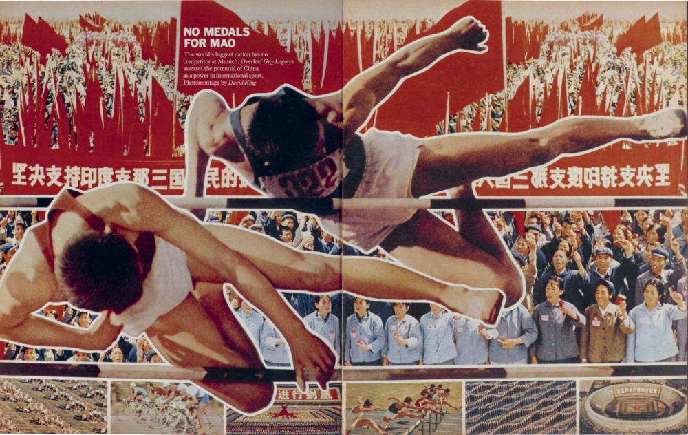
King’s entry into activism came after he watched a TV documentary on racism in South Africa in 1978. The day after, he delivered himself to the office of the Anti-Apartheid movement and offered his services. The years that followed saw him produce an astonishing array of material for causes from the Anti-Apartheid to the Anti-Nazi League (pictured, above), the Socialist Workers Party and the National Union of Journalists. King’s design and thinking still reverberates today. His unique talent was an ability to combine the blunt trauma force of a simple message with a richly resolved and often quite complex graphic approach – colliding words, symbols, and images with elucidating effect. To mark the publication of the monograph, we asked its author, Rick Poynor, to speak to Judy Groves, King’s longstanding friend and collaborator about her experiences working alongside him. —RICHARD TURLEY
———

David King, outside the Chelsea Hotel, New York City. 1968. Photograph by Roger Law.
RICK POYNOR: I’d like to start by talking about your political convictions in the early ’70s. Here in Britain, it was a very politicized time. The left was very active. What did you believe then and what were you doing?
JUDY GROVES: I think I was a libertarian, really. I was working for Oz magazine and Ink newspaper—the underground press. There were a few of these publications, not generally sold in mainstream shops but in left-wing bookshops, college campuses, and in the street. And yeah, there were anarchists and revolutionaries from all over the world who used to wander into our offices in Leicester Square. While I was working there, I was very much a part of this left-wing group. I moved to a commune in a disused shop in King’s Cross. The people I lived with had the same sort of politics—they were anarchists and libertarians—but I found them really, really sloppy, and it used to drive me mad. I wanted something with a bit more structure, and so I joined a Trotskyist party, the Socialist Labour League, later called the Workers Revolutionary Party. I was working for Time Out, a listings magazine covering cultural and political events in London, and I got very involved in trade union politics and was the mother of the National Union of Journalists’ chapel at Time Out for several years. It was very nice to belong to an organization, because my position was clear to the chapel, and I also tried to broaden it out and spoke about apartheid in South Africa and industrial disputes. So, that was my politics at the time: communal living and shared endeavors, study groups and lots of demonstrations.
POYNOR: Was there a feeling back then that if people like yourself on the left kept pushing, agitating, protesting, and organizing it could bring about real change?
GROVES: Yes, we definitely believed that revolution was around the corner, sadly. When I met David, I was rather shocked to find that he didn’t actually do demonstrations or do anything like that. He never went to union meetings either. But he put his energy into the subjects he chose to cover at The Sunday Times Magazine, where he was art editor, and he used his skills for political aims. And so that seemed fine to me.
POYNOR: When did you meet him and how did it come about?
GROVES: I think it was in ’72. He was at The Sunday Times, and I had a friend who also worked there. She invited me to their Christmas party. That was where I met David. He came back with me to what was actually a squat.
POYNOR: So you really clicked at first meeting?
GROVES: Totally, yes, after a few dances and even more drinks. He was married with a family, and his life was very, very different than mine. But we went on meeting, and then his father died, which was terrible for him. So, I started seeing him more, and gradually we were seeing each other all the time. It’s funny because I wouldn’t have thought he’d have admired my lifestyle, but it made him fed up with his own, that I was doing so many things and knew a lot of different people. It seemed much more exciting to him than going home after the office.
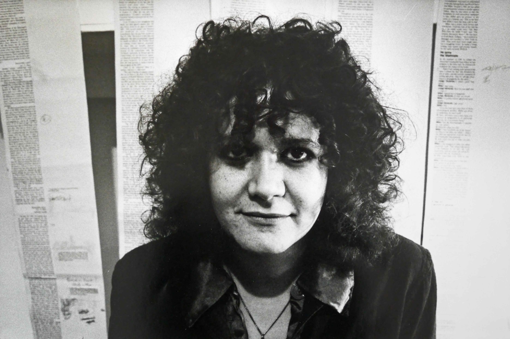
Judy Groves. King’s longstanding collaborator and friend. By David King.
POYNOR: What kind of person was he?
GROVES: Annoying. He was very annoying, because he was just so extreme. He didn’t appear to analyze anything. He had two expressions. One was, “Oh, I hate all that.” And the other one was, “Oh, I love all that.” We used to have arguments about that—that he wasn’t going into things a bit deeper. But that did change over the years. He never did join a political party, although he worked for many political groups, such as the Trotskyists, and for freedom fighters in South Africa, who were often Communist Party members. But he didn’t want to join anything, and I continued to prefer being part of an organization for quite a while.
POYNOR: Was he very driven, very focused?
GROVES: He was focused. This sounds like a contradiction, because he was a bit all over the place, but whatever interested him, whether it was the space program or some glamorous Hollywood story or politics, he absolutely immersed himself in it. But later, he focused mostly on the missing leader of the Red Army, Trotsky. Even after his book on Trotsky came out, he continued to look for evidence of the importance of this man. Soon after I met him he was designing a book on Charlie Chaplin. But we didn’t really work together much then, because he was still living at home. Sometimes he’d come around, and we’d discuss some work he was doing or I was doing. It wasn’t really until his marriage broke up, and he came to live with me in a basement flat in Islington in ’73 or ’74. His wife was going to take the children and go live in Amsterdam. He was very, very depressed about that, and that was when he drove through red lights, as far as I recall, because he was very distressed. Also, he used to drink quite a lot at that time. We both did, though that didn’t last for long. A car smashed into the side of our VW camper van, which somersaulted, throwing David on to the road where he lay unconscious with a cracked skull. He was in the hospital for several weeks and frail for many months after. David and I then moved into the house that his wife had vacated on St. Paul’s Road. Of course, then it was possible for us to work together. There was loads of space. It was exciting and a really nice way to relate to somebody where you’re working with them on the same projects or parallel projects. After the car crash, he needed quite a lot of looking after, and so I went part-time at Time Out and gave up my trade union work.
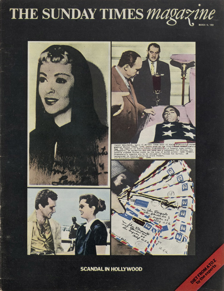
The Sunday Times Magazine cover, March 16, 1969. Cover story about the killing of film star Lana Turner’s boyfriend, Johnny Stompanato. Screenprint montage by David King.
Inside spread from The Sunday Times Magazine, 1972. Photomontage by David King.
POYNOR: When did the political posters start happening and how?
GROVES: Well, I think he was always a very militant anti-racist, so when things were really hideous in South Africa, he went down to the Anti-Apartheid Movement offices and offered up his services, which they were very pleased about. At the same time, he was asked by the Workers Revolutionary Party and the International Socialists to design posters, books and pamphlets. Also, the International Metalworkers’ Federation asked him to do things. There wasn’t a single room in David’s house that wasn’t to do with work. I had my own room for doing other work: Latin American Newsletter, Marxism Today, and publications like that I used to work for. We often just worked together down in the basement. There was plenty of room for the hot waxing machine and scalpels and black paper to cut out. He would work on top of a plan chest, which was just the right height. But all the other tools and things were on the table tennis table. It’s funny because it was horrific, the work—the subject matter was upsetting and horrible. People from the ANC and victims of apartheid would come around. And yet, we did manage to laugh, not at the subject, but we did have jokes, and it wasn’t a terrible, oppressive atmosphere at all. We used to be in hysterics when we realized that something was spelled wrongly in the text, because that would have been typeset. If there was a vital comma missing, for example, we’d have to look for spare type from the galleys, and run them through the wax and then cut out a comma, which I would balance on the tip of the scalpel and go across the room to give to David. It was so precarious. We would say, “That’s the very last spare comma.” There was quite a lot of that going on, fun and games.
POYNOR: This is all pre-digital, of course, when the artwork was assembled on paper.
GROVES: Absolutely. Well, it was called camera-ready artwork, which is something that David didn’t know about at The Sunday Times because they did things differently with layouts that they’d give to the printers and compositors. But at the magazines and the places where I worked, we did camera-ready artwork on boards. We would stick all the components down. At Time Out we had a headline machine where you could type out headlines. We had a dark room for making screen prints. Everything else, we just cut out. For his posters, David cut out things like stars and arrows and put them through the hot wax machine. It had a reservoir in it that melted slabs of wax and then a roller, and you could push the picture or type through and then stick it where you wanted it. You could also peel it up if you changed your mind. It wasn’t fixed until you went over it at the end with a large roller flattening it. If David had done something with quite a bit of text, which he’d broken up with rules, you could at that time buy rolls of thin black tape from an art shop. Those would be used on the artwork. Larger areas of solid color were cut out with a ruler and a scalpel.
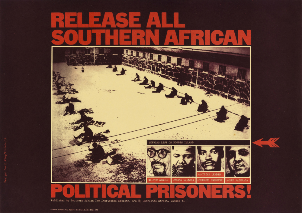
David King/Proletcult, “Release All Southern African Political Prisoners!”, poster for Anti-Apartheid Movement, 1977.
POYNOR: The posters David designed are extremely distinctive because they are so bold and punchy. Where did this graphic language come from?
GROVES: A lot of it came out of the opportunity to do camera-ready artwork. David was taught basic design and composition at college and he seemed to have a natural ability for that, which is why camera-ready artwork suited him so well. Although he made sure that all the text could be read, he loved moving things around to get the best possible composition. I think that had a big effect on his work. Also, by then, he was beginning to look at Russian posters and graphics. Recently, I came across some posters done by Popova, which were for the theatre—blocks of type with thick bars underneath. He was probably influenced by that as well.
POYNOR: I met him only later in the 1990s, but he was always very emphatic and excitable, and when we look at his design, it’s very emphatic, as well. Is this work, on one level at least, a direct expression of his personality?
GROVES: Yes. He couldn’t have done it any other way really because of his personality, but he was able to fine-tune it. After all, he had the same personality at The Sunday Times, and they were very strong layouts. But he didn’t at that time have the freedom, because of the method of working, to be as emphatic as he was later with his posters. And actually, going back, isn’t it all just like he used to say—”I hate all that” or “I love all that”—which used to so infuriate me? But when he put it to wonderful use with his designing, it wasn’t annoying at all. It was brilliant. He knew exactly what he wanted to do.

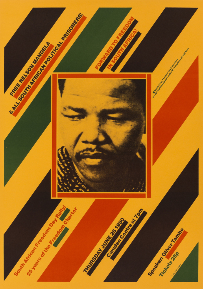
(ABOVE) David King/Proletcult, “Apartheid in Practice: Health & Housing”, poster for Anti-Apartheid Movement, 1978. (BELOW) David King, “Free Nelson Mandela and All South African Political Prisoners!”, poster for Anti-Apartheid Movement, 1980. Photograph: Eli Weinberg (detail)
POYNOR: Did he ever talk about this ultra-bold style or rationalize it? Did he feel that it was the most effective way of conveying an urgent message to a viewer?
GROVES: He thought it was important that the work that the left put out should have a feeling and a look about it, which could then be used by whoever wanted it—sometimes very badly. But it did actually define the graphic work of the left for a long time. He kept repeating these devices, which made it recognizable, like the arrows and stars and the underlining. But it wasn’t just decoration. It was insistent: here’s the demonstration, this is where it’s going to be, and at this time. The posters are full of energy and drive people on.
POYNOR: It makes the event look exciting, urgent, and necessary.
GROVES: Yes, definitely. In his Rock Against Racism series with the badges and stars, he used to really enjoy it that other groups took up his style and did their version of it. It was still graphically the same, but it would say things like “Vegetarians Against the Nazis.” Or his friend from college, Alfredo, had “Fading Beauties Against the Nazis,” things like that. That didn’t annoy him at all. He loved it.

Poster for the Anti-Nazi League, 1978.
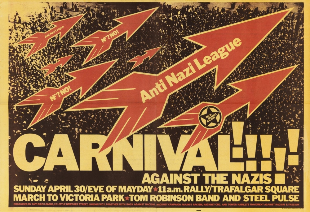
‘Carnival Against the Nazis’ poster for Rock Against Racism, 1978.
POYNOR: I saw a quotation from Paul Holborow of Anti-Nazi League, remembering those days of working with David, and he said, “He was a nightmare to work with because he was such a perfectionist.”
GROVES: Yes, and sometimes we’d argue about that, because we would have finished something that had taken hours, and he’d say, “Oh, I think that photo should be bigger.” And I’d say, “No, no, I think it’s fine,” because by then it was 2 in the morning. But he would insist. He wouldn’t let it be finished until he was absolutely happy with all aspects of it.
POYNOR: So, even though he always used to say, “It’s all about content. It’s not about style,” he was very concerned with details of style and getting it right.
GROVES: Yes, but it was always to do with the content. If he thought a photograph of Nelson Mandela, say, wasn’t sufficiently strong, it wasn’t just that he wanted it to look more attractive or anything. No, he wanted to emphasize that Nelson Mandela was imprisoned, and we’ve got to campaign to get him out. It was about content. Sometimes, believe it or not, he would reduce the size of the type.

‘Amandla! Free South Africa Tour’ poster for African National Congress, 1985.
POYNOR: During these years, through the ’70s and into the ’80s, David was working on building a collection of Russian Revolutionary graphics and photographs, so this was already under way when you met him. In 1970, working on an article about Lenin for The Sunday Times, he’d been to Moscow for the first time. By ’72, he’d co-authored a book about Trotsky with the Sunday Times journalist Francis Wyndham. What do you recall about David’s collecting in the ’70s?
GROVES: Well, he was quite obsessed with the fact that Trotsky had been removed from all the Soviet publications and everything and that he was a non-person, plus that fact that he was murdered. So, he gradually started coming across photos related to Trotsky. But at that time, he was collecting other material as well. He was collecting things to do with space launches, which he covered for The Sunday Times Magazine, crime, and scandals. I’ve still got a drawer full of his stuff on Nixon, for example. He loved all that.
POYNOR: Why do you think he was so drawn to American imagery?
GROVES: Because it was both glamorous to his eyes and very strong and impolite, which fitted in with his way of seeing.
POYNOR: And glamour is another kind of boldness. A lot of the Russian material in the collection he found in America, from dealers and individuals who hoarded this material for years in their basements.
GROVES: Often they were Russian immigrants, but not only in America, also France, and anywhere that Soviet immigrants had gone and settled. People would often give him other contacts. I was in New York with him a few times, and much of that time was spent either visiting people or these old bookshops. He was really collecting in a very enthusiastic way. He found stuff here in Britain, as well. One source was Ron Gray, a book dealer, who owned the radical bookshop Hammersmith Books. That was where David found a pile of copies of USSR in Construction Magazine just lying on the floor. In those days, there were other left-wing bookshops where Soviet material could be found. He told this wonderful story about suddenly coming across the one issue of USSR in Construction that he hadn’t got, and just as he was moving towards it, an arm came over his shoulder and picked it up and took it to the cash desk. In the end, he had every copy.
POYNOR: Eventually the collection ran to around 250,000 items. Tate acquired it for the British nation in 2016. That’s an extraordinary amount of activity and dedication. Did he say much about what he was doing with the collection?
GROVES: A lot of the time, he was just focused on searching for things. When Gorbachev came to power, it was much easier to find material in the Soviet Union, so he went there more often. People were interested in using his images, and so he had this working library. Sometimes, he let people use things for nothing. But depending on who and what they were, he would charge. It provided an income for him. He wanted eventually to leave the collection to Tate because he wanted it to be accessible. So anyone studying the history of the Soviet Union, or any aspect of it, would be able to look through this important and rare collection.
POYNOR: Tell me about the day, around 1980, when you had visitors from Hollywood at the house.
GROVES: You’re talking about Warren Beatty and—what’s her name?—Diane Keaton. They wanted visual references for the Russian Revolution, and inspiration for the film Beatty was making, Reds, so it was research. Well, I was annoyed about it, because they came with a chauffeur-driven Rolls Royce, which they parked outside. There were a lot of council houses (social housing) in the area, including the immediate neighbors, and I thought it was unbearable really, them parking like that. I knew that David was expecting them, so when the doorbell rang, I opened the door, and then I just shouted up the stairs and said, “David! Your friends are here,” rather crossly.
POYNOR: You weren’t even a little bit excited to meet the pair of them?
GROVES: No, not at all. I’ve never liked celebrity. In 1974, when we went to see Muhammad Ali, who David was an enormous fan of, he was so in awe that it was one of the rare occasions when he became rather quiet. I wasn’t at all shy of him, and in fact, we sat on the sofa, me and Ali. I was at that time working for a Black campaigning group, Dashiki, and I told him all about it, and he was very interested. We spoke about vegetarianism and so on. This was in Aunt Coretta’s kitchen, which was at his training camp. David was subdued in the presence of this great man, although Ali clearly liked him a lot.
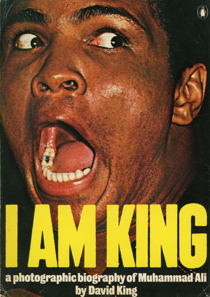
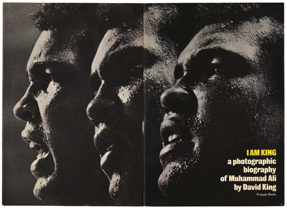
I Am King: A Photographic Biography of Muhammad Ali by David King, published by Penguin Books, 1975.
POYNOR: David authored I Am King, a remarkable photographic biography of Ali, in 1975. Why was he so drawn to Ali, do you think?
GROVES: Well, for lots of reasons. For one thing, he was beautiful and powerful in his appearance, but also he was political. He wouldn’t go and fight in Vietnam. He was raising consciousness amongst the Black and oppressed. He was a good bloke. That kind of social awareness was unusual, then, especially for a boxer. David was a great fan. We were in New York. I think it was the Chelsea Hotel. David phoned Ali’s camp to see if somebody could tell us when he’d be there and if we could possibly go and visit so David could take photographs of Ali. Ali himself answered the phone. David asked him, and Ali said, “Oh, yeah, come on over.”